Top Gear Homepage
Creating a destination experience for all car lovers.
Role
As the sole UX/UI designer on this workstream, I led the process of gathering requirements, planned and facilitated ideation workshops with our Editorial, Product, and Engineering teams, created all key deliverables, and collaborated closely with developers throughout implementation.
Tools & Platform
Main tool of choice was Figma, while using Principle for high fidelity prototyping and Miro for remote workshops.
This was a responsive web project.
Project Length
This project lasted 5 weeks, including a brief, research, ideation, wireframes, visual design, and prototypes, and constant engagement with our stakeholders.
Background
Top Gear’s homepage enables users to discover content.
It is a mixture of latest content and editorially curated content offerings.
Goal
Redesign the homepage so it showcases our breadth of content and serves our editorial and user needs, while increasing our advertising metrics.
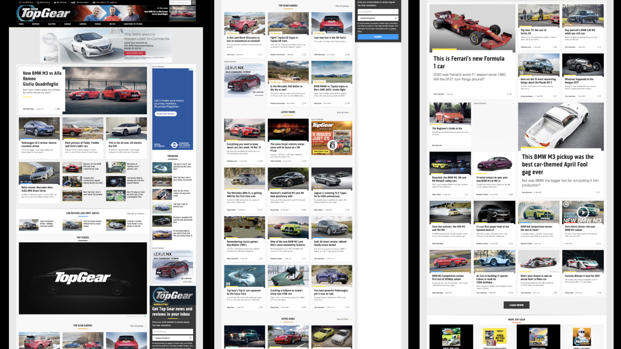
Previous homepage

Current Problems
01.
Static content
The editorially curated sections aren’t updated regularly enough by editorial so users aren’t seeing fresh content.
We currently don’t showcase popular/trending content in a way that is useful for users.
Users may not be aware of the breadth and depth of our content and archive based on what they can see on these pages.
02.
Inconsistency between the different sections
Hard for users to know the information hierarchy and what to expect (which can be off-putting and lead to exits).
Homepage hierarchy is jumbled - you start in news, have some sections interspersed, and then end up back in news content towards the bottom of the page.
03.
Our business numbers are not good.
Our target is to have our advertisements seen at a rate of 80% but its currently at 53%.
Our current CTR for the homepage is currently at 8% (We have a high bounce ratE)
UX process
01 Audit of the Homepage
As I was unfamiliar with the site, I started off with an Audit of the current site to understand the different sections, the type of content and advertising positioning.
02 Competitive Analysis
To get a sense of the current offerings on the market, I looked at over 30 websites ranging from other automobile publishers, news outlets and any other media website to understand:
How they segment and structure their content
Layout and hierarchy of content
Unique features
Ad placements
Common themes
This allowed me to understand what other publishers were doing well, what they could improve on and where there was an opportunity for us to improve.
03 Stakeholder Interviews
I interviewed the Editorial team, Head of Commercial, and my Product Manager via Zoom to identify the current needs and issues with the homepage. I took notes on Miro and organized them into themes.
04 Ideation
Remote workshop planning
This was with all stakeholders to ensure input to design and future buy-in. The picture shows the material used in the ideation workshop to outline the plan for the day, problems to solve and ideation techniques for anyone new to this.
Ideation and Facilitation
Some of the sketches from the day from the team, added to MIRO then discussed by all.
Themes
To gain a deeper understanding of whether there were any recurring themes emerging from the various ideas presented, we systematically grouped these ideas together and then labelled them accordingly. This process allowed us to further explore the connections and patterns that might exist among them.
Wireframes
With the various themes in mind, I carefully designed a series of wireframes that incorporated the different ideas organized by components. This allowed me to gain a clearer understanding of both the feasibility and responsiveness of each design element.
Voting on ideas
We held a few sessions with a smaller group of the leads of each disciple - Editorial, Product and Engineering. They would vote from 1-10 for the following categories: New, Useful and Feasible. This helped us prioritise and reduce the number of great ideas we had.
3 concepts to explore
After completing the voting process, I was pleased to find that I was able to create three distinct concepts that incorporated the components which received the highest number of votes.
We presented the different concepts with our stakeholders and they wanted concept 3.
It successfully met all of their specific requirements, standing out as a truly unique option in the realm of advertising. Additionally, our carefully crafted content maintained a pleasant balance that appealed to a wide audience. They expressed their enthusiasm for the top story feature, appreciating its sticky functionality as users scrolled down the page, enhancing their overall experience..
05 Visual Design
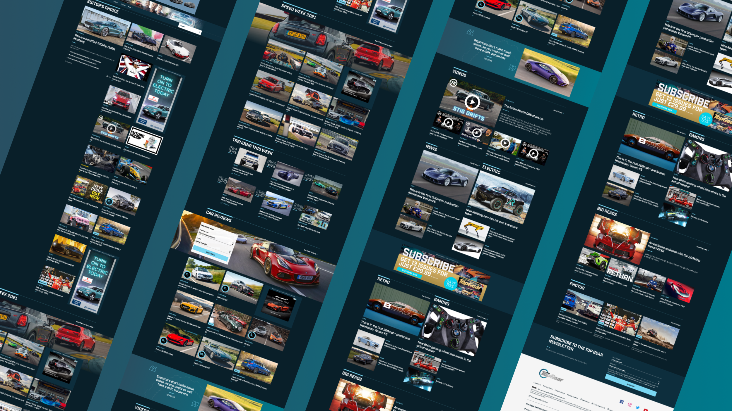
Now that our stakeholders were happy with the wireframe concept, I started designing the homepage making sure it aligned with our new style guide and identifying where we could adapt and improve it.

Video Demo
Here is a video demo of the homepage in action - the prototype was created using Principle.
We needed to create an MVP to ensure we deliver on time.
Therefore I needed to amend the desired design into a simpler solution while keeping as much as possible just for now.
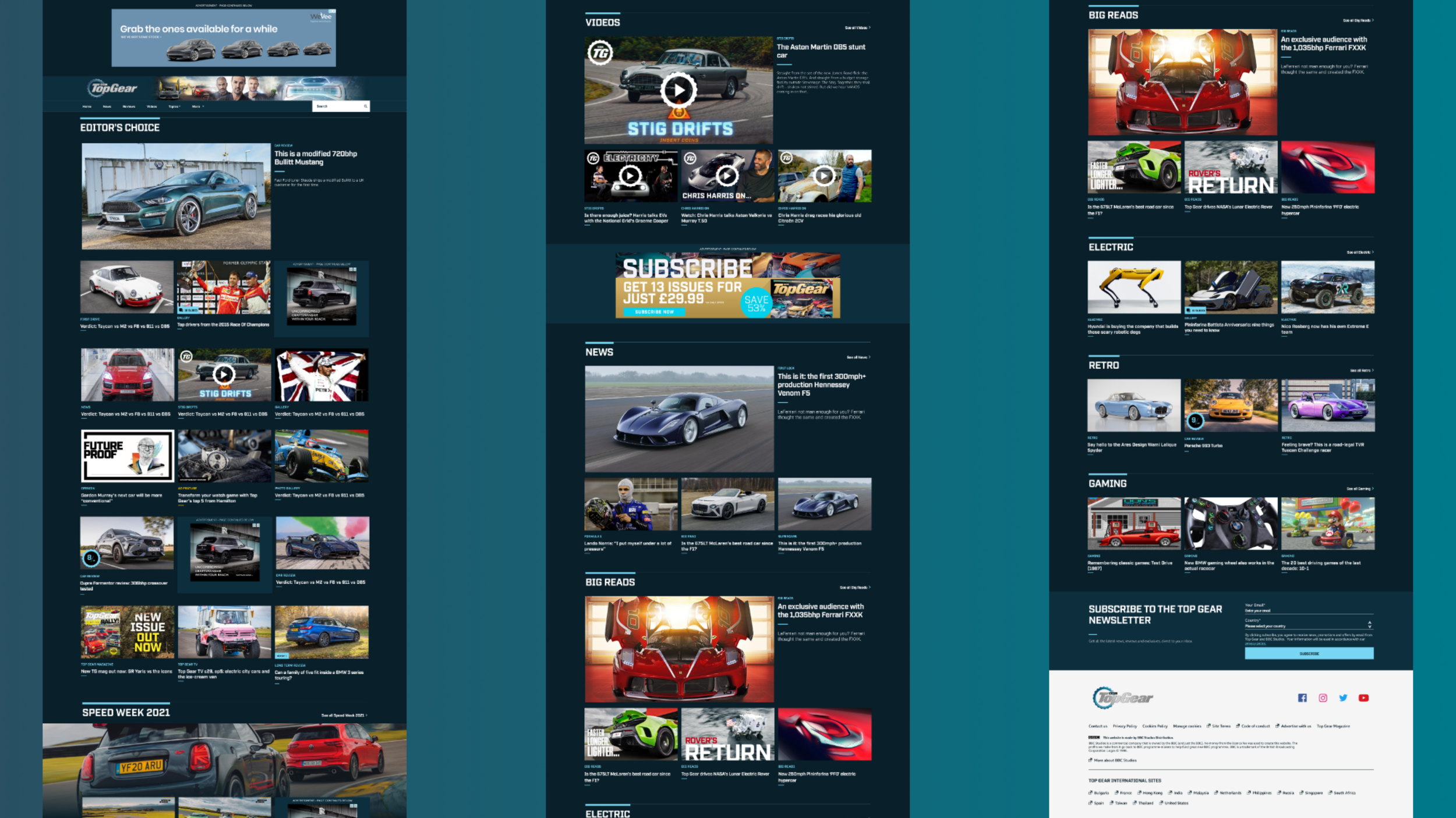
06 MVP
We were able to successfully maintain the majority of the homepage layout, but we found that the sticky top story feature would necessitate significantly more effort from the developers to implement properly. Therefore, we decided to remove this feature for the time being, allowing us to focus on building it more effectively after the launch.

07 MVP Results
Launched on time, within our deadline.
Addressed all identified issues, clarifying structure and enhancing information hierarchy, clarity, and navigation.
We increased ad viewability by 50% by utilising higher-value ad units and better placements, reaching our target of 80% viewability.
Increased the CTR for articles within the homepage from 8% to 25%
Great feedback from our Editorial and Business Stakeholders.


