Spend Visualisation
Helping customers feel more in control of their spending
Role
As the Senior UX/UI Designer on this project, I led the design process, collaborating with a junior designer. I was responsible for gathering requirements, conducting user research, facilitating ideation workshops, and creating key design deliverables.
Tools & Platform
My primary tool was Figma, used for design, prototyping, and running ideation workshops. The project focused on developing a native app for both Android and iOS platforms.
Project Length
This project lasted 4 months from brief, research, ideation, wireframes, visual design and prototypes, with constant engagement with our stakeholders.
Background
Capital one is an online credit card provider aiming to help people succeed with credit.
Goal
Help users better understand and manage their spending, while increasing responsible card usage.
UX Strategy
Our strategy team did extensive research to determine what makes a user use their card and this is the high level output from that research. The research was made of several data collection methods, both qualitative and quantitative data. This was the starting point for our project and our focus was on the ‘Control’ element of this equation.
Reviewed UX Strategy to gain insight into the user problems
We reviewed the UX strategy deck to understand the rationale and proposal better, identifying key themes to deepen our understanding of the problem.
Problem
Feeling out of control of credit prevents utilisation
Key points
11% of Capital One customers never use their cards because they are worried about overspending.
12% of customers said feeling more in control of their spending would encourage them to use their credit cards more.
21% of customers said they had closed their accounts because they didn't want to be tempted by spending.
42% of customers do not want a higher credit limit because they worry they will overspend.
Hypothesis
We believe by helping customers feel in control of their finances, they will feel more confident and increase their card use.
The design process begins
Competitive Analysis
To get a sense of the current offerings on the market, I looked at as many financial apps on the market to understand how they helped customers feel more in control of their finances. Some of features were:
Financial insights
Spend visualisation charts
Spend categorisation
Transaction notifications
Unique features
Competitor Testing
We conducted unmoderated interviews through usertesting.com with 7 credit card customers, showing finance spend visualisation features to understand customer appetite and how these could help them with their credit.
Features Tested
From our competitive analysis, these 5 types of features covered the range of features we saw that we wanted to get feedback from users. We used these features for stimuli to prompt conversation with our users to understand livability, familiarity, usefulness and expectations of offering from a credit card provider. The 5 features are:
Merchant categorisation
Spend visualisation charts
Spend categorisation
Location and spending insights
Summary of testing
Most of the participants liked all the features and would find them useful. They would be useful because these features would:
Cultivate good habits
See their spending broken down
Be easier to interpret their finance
Ideation
We shared the research with our Head of Product, Tech Lead, and Design Lead. We outlined the benefits of these features and why they would help customers feel more in control. This allowed us to get buy-in to continue the project and to start ideation workshops.
Sketches
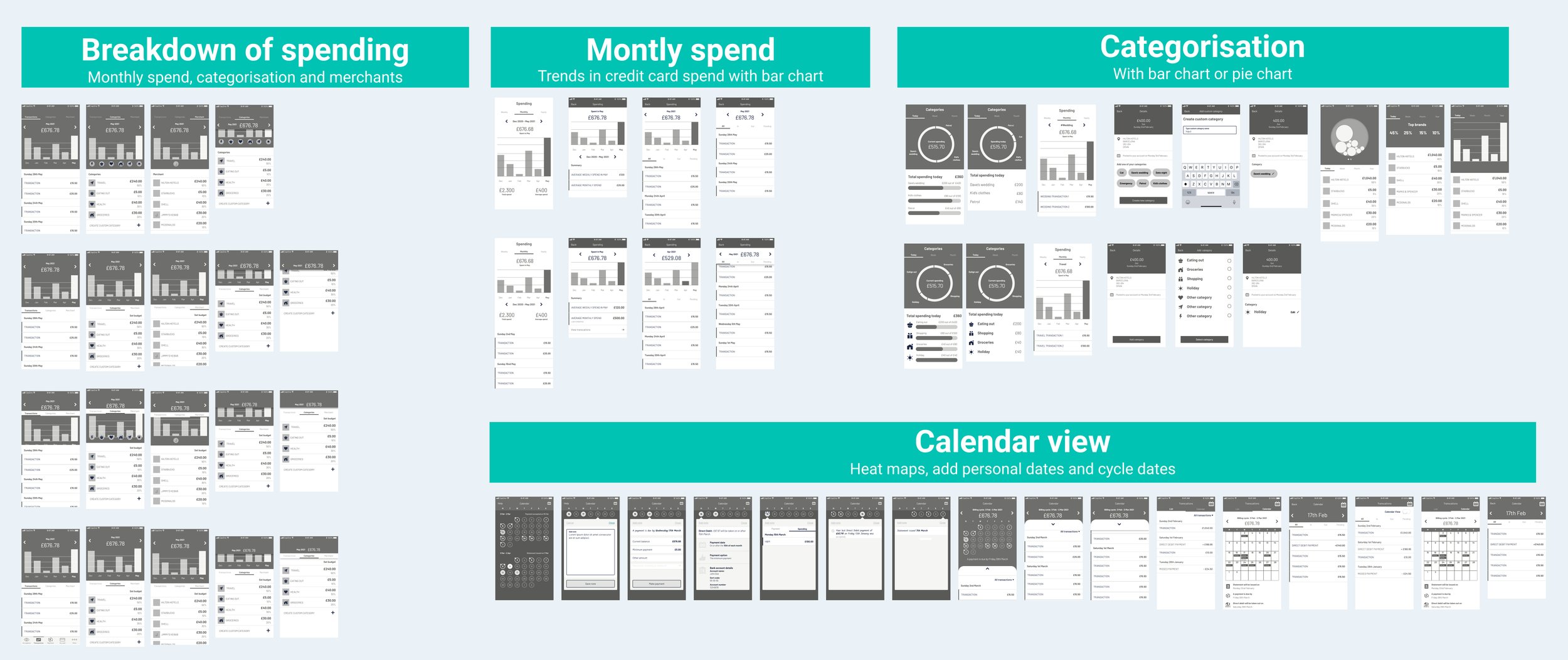
Knowing these types of features would be useful in feeling more in control of their finances, that they were expected features to be offered and the overall usefulness we ran an ideation workshop with a mix of different disciplines on the team through a virtual workshop.
We then themed all the ideas into categories and counted the votes for each to understand where the team thought the feature would provide the most value for the user. These categories were
Spending categories
Type of data visualisations
Written insights (such as Spotify wrapped or this time last year)
Calendar view (similar to a heatmap of spending)
Highest voted themes
The Product Manager and I went through these concepts to assess business value
We separated the features into 2 different categories - Had some business value and didn’t have any business value.
We identified that 5 concepts had business value and were worth further exploring.
Wireframes
The junior designer and I independently developed wireframes for each sketch to compare our interpretations. After completing our work, we reconvened to present our designs and combined the strongest elements from each concept.

User Testing
I conducted two studies: a survey and moderated user interviews. First, we ran a survey on usertesting.com with 65 participants who have a credit card and use their bank’s app, to gauge customer interest, usefulness, and familiarity with the concepts. The survey provided us with the "what," but we needed to understand the "why." To dive deeper, we held eight user interview sessions with Capital One customers to explore their interest in these features, understand their potential usefulness, and assess whether they would increase engagement with their accounts.
Survey
We showed all 5 concepts that had business value to 65 participants and asked them 5 questions related to the features. The 5 areas of interest were:
Would you use your card more with this feature
Would you find this useful
Have you seen this before
Would help you better understand your finances
Would you feel more in control
User interviews
The second part of our user research was to conduct moderated interviews with 8 of our customers. The session was broken down into 2 parts - the first part was general questions on their card use, feeling of control and the second was to rank all 5 features on a scale from 1-10, based on how likely each feature will make them use their card more.
Top 3 features
Based on the survey results and the overall feedback from the user interviews, we shortlisted these 3 concepts to take further forward. These concepts were:
Spend categorisation
Monthly spending chart
Calendar spending view
Visual Design
With the concepts shortlisted, we moved forward with visual design, exploring how all three ideas could be integrated into a cohesive experience. Throughout the design process, we adhered to the Capital One design system to maintain a consistent look and feel.
Tech Effort
Due to the number of concepts and engineering effort to create the holistic design, we wanted to build an MVP and validate the concept as cheaply as possible, to gather early user feedback, and validate market demand. This approach would reduce risk, ensuring we build something users need, and lets you enter the market quickly while refining the product based on real-world insights.
I conducted value assessment workshops with the Engineering Lead, Lead Product Manager, Business Analyst, and Legal to determine which concept offered the most value with the least effort.
MVP
Given the ‘Monthly spend chart’ scored the highest from our framework, we went away and boiled our designs down the MVP version, ensuring it was the minimum functionality that we believed to provide user value.
MVP Designs for IOS and Android app
We made several changes to the previous design to quickly validate the concept in production, using the Capital One design system along with the native application guidelines and components.
Usability testing
Before finalising the designs, we conducted usability testing with six customers to ensure they understood how to interact with the new designs. Based on their feedback, we made the necessary adjustments.
Before and After
Specs - Interaction
Specs - Accessiblity
Below shows the previous transactions screen and the updated transactions screen with the new monthly spend chart
A/B Testing plan
Given the company's low risk appetite for these types of features, we decided to release them to just 5% of the app population. We will run the test for 3-6 months to assess its impact on spending and login metrics.
Measure of Success
Measure of success 1
Quantitative Metrics: Launch an in-app survey on the transactions page for both groups to compare usefulness ratings and feedback, assessing if the test group rates it as highly or higher than the control group.
Results for success criteria 1
3.3/5 Average score for the control group
4.2/5 Average score for test group
Measure of success 2
Quantitative Metrics: Track the average number of logins per user to evaluate engagement, comparing whether the test group demonstrates an increase in login frequency compared to the control group.
Results for success criteria 2
2 Average app logins per month
2.3 Average app logins per month for the test group (15% increase)
Measure of success 3
Quantitative Metrics: Greater or equal ‘Average spent’ than the control group
Results for success criteria 3
To be determined*
*The project was paused midway through the test due to a company-wide restructure and shift in strategic priorities. As a result, the time needed to understand spend behavior and gather comprehensive results fully was limited.


